OPAL BY OPALESCENCE
What I Worked On:
Brand Architecture
Brand Campaign
Packaging Design & Copy
Website
Digital Media
Social Media
CRM
PR Event Activation
When the world’s #1-selling professional teeth whitening brand decided to the launch a DTC brand, we gave them the consumer-friendly glow-up they craved.
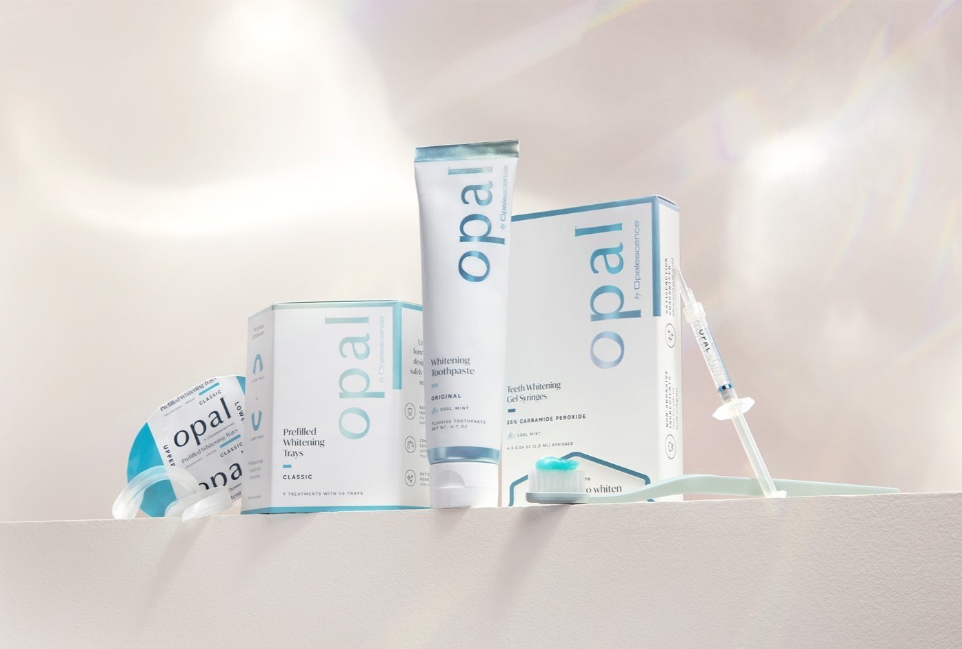
Over the past 30 years, Opalescence set the standard for professional teeth whitening, brightening more than 100 million smiles in dentists’ offices around the world. But they wanted to give consumers that just-left-the-dentist-chair feeling from the comfort of home. So, we helped them launch Opal™ by Opalescence®, a better-for-you teeth whitening brand created by dentists for at-home use.
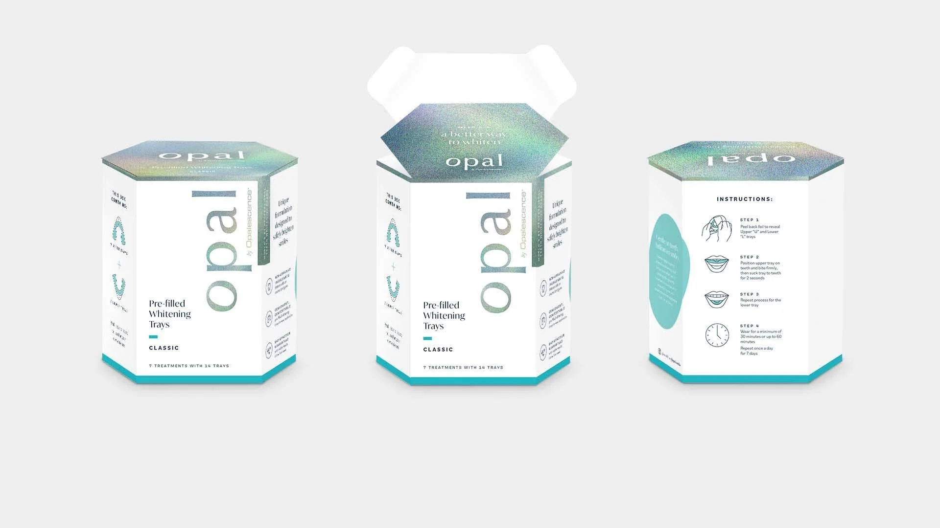
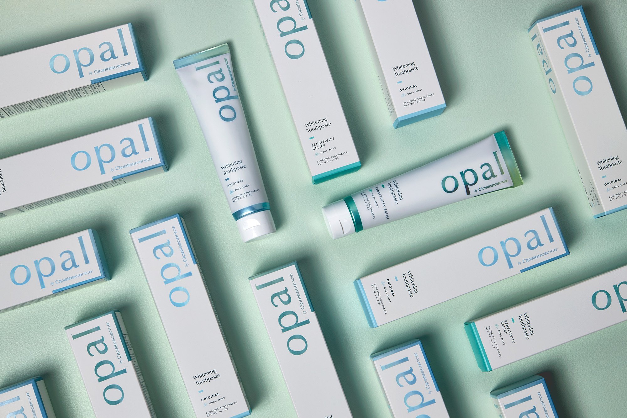
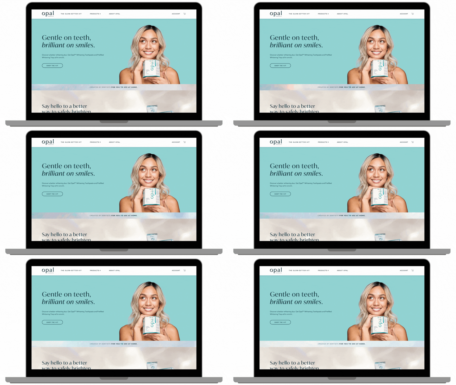
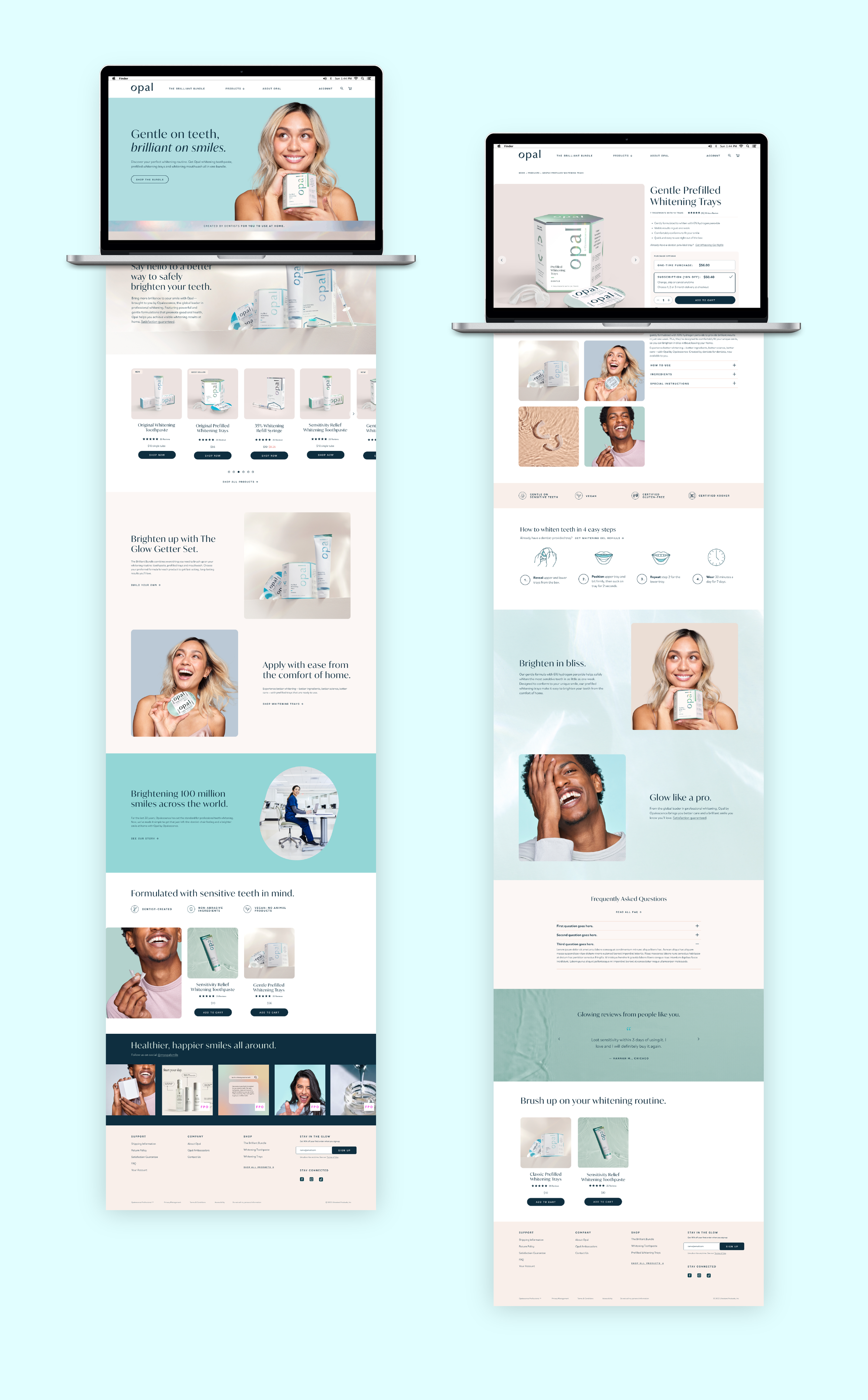
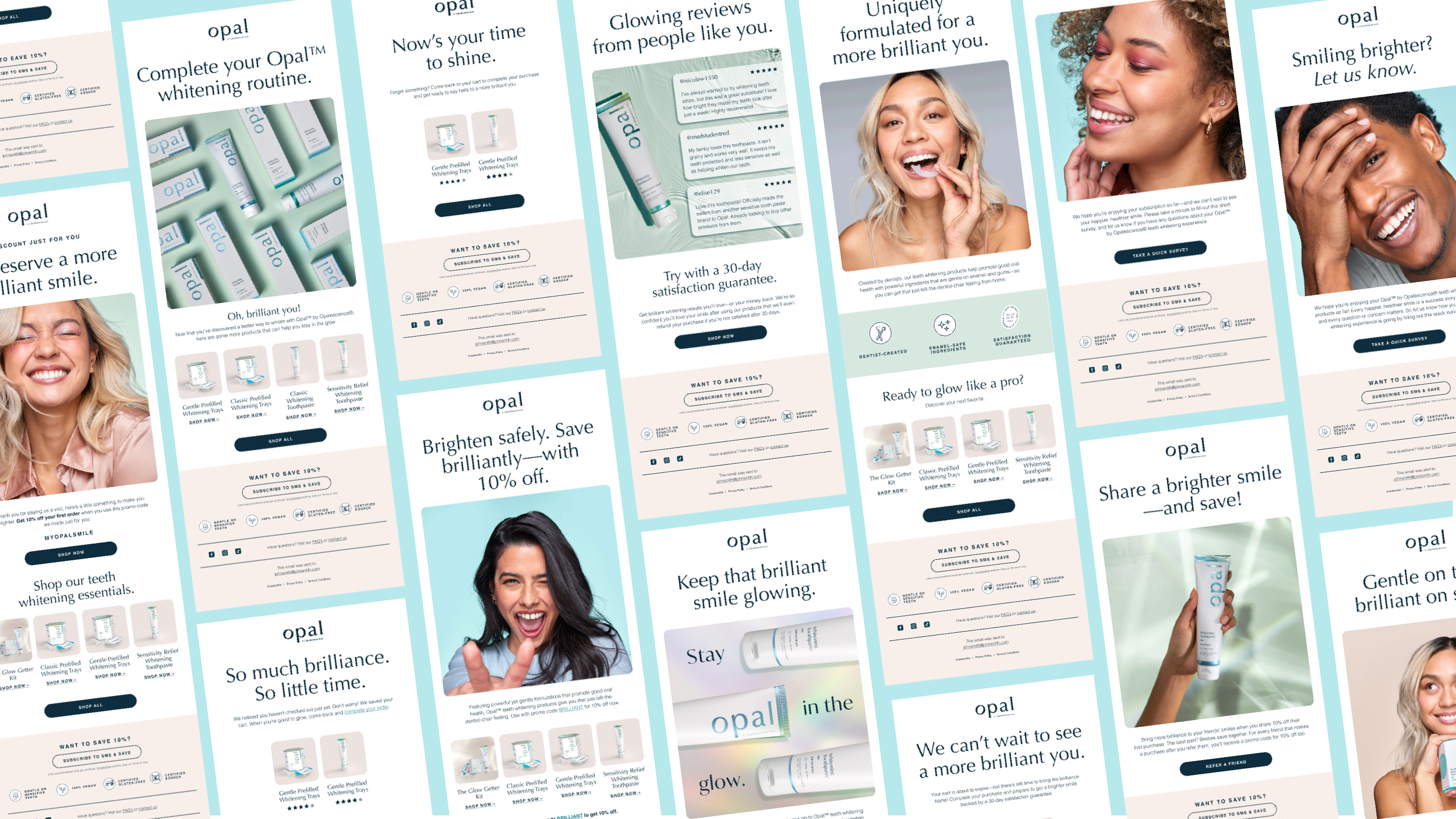
We developed the new brand name, strategy, foundation and visual identity, creating the logo and brand guidelines, photography, packaging, website design and copy, organic social and paid media, new product launches, along with CRM programs and PR events.
My role: Associate Creative Director, Copy
Associate Creative Director, Art: Sarah Zimmer
Designers: Sam Knox, Alex Dodge
Copywriters: Jose Vega, Benton Olivares
Agency: AMP, Upshot
A Better Way to Whiten
Brand Guidelines
I worked closely with Amp Agency’s SVP of Creative Strategy Brian Priest to craft a brand architecture that leveraged the world-class credibility of Opalescence for the launch of at-home brand Opal.
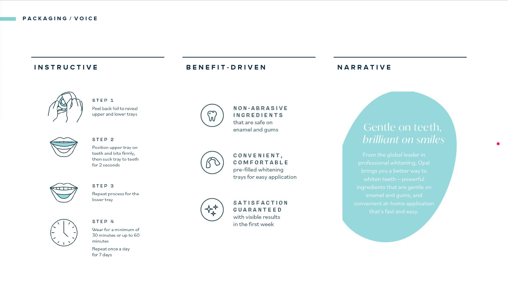
After testing initial claims and headlines with focus groups, I also worked to develop the brand voice & tone, balancing the need to inform and educate with the need to engage and excite to help consumers feel both confident and comfortable in their quest for better teeth whitening products.
Below, you can see a couple snapshots pulled from our comprehensive brand guidelines.


